

Before you begin
- Labs create a Google Cloud project and resources for a fixed time
- Labs have a time limit and no pause feature. If you end the lab, you'll have to restart from the beginning.
- On the top left of your screen, click Start lab to begin
Clone the repository, re-create the flutter project and run the starter app
/ 30
Add TextField widgets in the lib/login.dart
/ 10
Add buttons in the lib/login.dart and replace the section of the code in the home.dart file
/ 20
Add a top app bar
/ 20
Make a collection of cards
/ 20
Material Design is a system for building bold and beautiful digital products. By uniting style, branding, interaction, and motion under a consistent set of principles and components, product teams can realize their greatest design potential.
Material Components for Flutter (MDC-Flutter) unite design and engineering with a library of components that create a consistent user experience across apps and platforms. As the Material Design system evolves, these components are updated to ensure consistent pixel-perfect implementation, adhering to Google's front-end development standards. MDC is also available for Android, iOS, and the web.
This lab will guide you through building an app called Shrine, an e-commerce app that sells clothing and home goods. It will demonstrate how you can customize components to reflect any brand or style using MDC-Flutter.
In this lab, you'll build a login page for Shrine that contains:
Read these instructions. Labs are timed and you cannot pause them. The timer, which starts when you click Start Lab, shows how long Google Cloud resources are made available to you.
This hands-on lab lets you do the lab activities in a real cloud environment, not in a simulation or demo environment. It does so by giving you new, temporary credentials you use to sign in and access Google Cloud for the duration of the lab.
To complete this lab, you need:
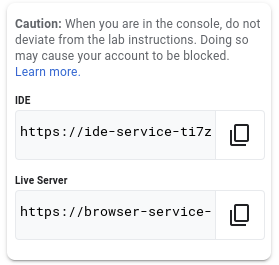
In this lab, you will use a custom editor that includes the Flutter and Dart extensions. From the initial Qwiklabs panel:
IDE link:In this section clone the material components starter app repository.
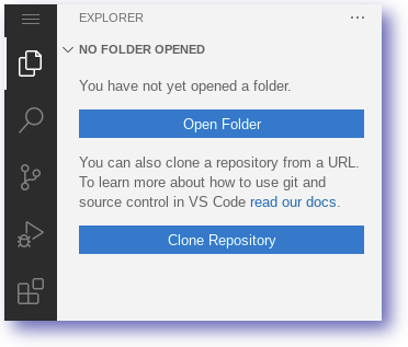
Explorer Icon.Select the Clone Repository option.
Paste the following repository name:
Click Clone from URL.
Set the destination folder as below and click OK.
You can safely ignore any pop-ups in your editor (including opening the folder).
Click Open Folder from the Explorer panel and navigate to the folder /home/ide-dev/material-components-flutter-codelabs/mdc_100_series. Click OK.
Confirm the notifications to get packages
The material components starter app is designed to be run and tested as a mobile app. Use the editor to quickly create a web build which you can use for rapid testing.
In the editor, open a new Terminal by clicking the Application Menu > Terminal > New Terminal. You can also press ctrl + shift + ` to open a new Terminal.
Ensure you are working from the material-components-flutter-codelabs directory:
You'll now see a web folder appear in your mdc_100_series directory.
Flutter has added the files necessary to build and test this application on the web.
To run the web application start the server and then use the Live Server to view the result.
The running web server should look similar to below:
Click Check my progress to verify the objective.
If you haven't already, expand the mdc_100_series and lib folders in your Code Server explorer.
Open up lib/login.dart.
Notice that it contains:
import statement that brings Material Components into this file.LoginPage public class that represents the entire page displayed in the simulator._LoginPageState private class that includes a build() function to control the UI widgets.To begin, you'll add two text fields to your login page, where users enter their username and password. You'll use the TextField widget, which displays a floating label and activates a touch ripple.
This page is structured primarily with a ListView, which arranges its children in a scrollable column. Let's place text fields at the bottom.
lib/login.dart, add two new text fields and a spacer by replacing line 45, // TODO: Add TextField widgets (101), with this snippet:The text fields each have a decoration: field that takes an InputDecoration widget.
The filled: field means the background of the text field is lightly filled in to help people recognize the tap or touch target area of the text field.
The second text field's obscureText: true value automatically replaces the input that the user types with bullets, which is appropriate for passwords.
Save your changes to lib/login.dart.
In your Code Server terminal, press the r key to perform a hot reload.
Return to the tab displaying your web app and refresh it.
You should now see a page with two text fields for Username and Password! Check out the floating label animation.
Click Check my progress to verify the objective.
Next, you'll add two buttons to your login page: "Cancel" and "Next." You'll use two kinds of MDC button widgets:
In lib/login.dart:
// TODO: Add button bar (101) with this code:Then add two buttons to the OverflowBar's list of children:
Save your lib/login.dart file.
Hot reload your app by pressing the r key in the Coder Server terminal. And, return to the tab displaying your application.
You should see two buttons appear: Cancel and Next.
The OverflowBar handles the layout work for you. It positions the buttons horizontally, so they appear next to one another.
Touching a button initiates an ink ripple animation, without causing anything else to happen. Let's add functionality into the anonymous onPressed: functions, so that the cancel button clears the text fields, and the next button dismisses the screen:
To make it possible to clear the text fields' values, you'll add TextEditingControllers to control their text.
_LoginPageState class's declaration in login.dart, find the // TODO: Add text editing controllers (101). Replace it to add the controllers as final variables:// [Name] comment. Add a controller: field and set it to the _usernameController:// [Password] comment. Add a controller: field and set it to the _passwordController:CANCEL onPressed function, replace // TODO: Clear the text fields (101) with a command to clear to each controller:login.dart. Now when you type something into the text fields, hitting cancel clears each field again.This login form is in good shape! Next, you will advance your users to the rest of the Shrine app.
To dismiss this view, you want to pop (or remove) this page (which Flutter calls a route) off the navigation stack.
NEXT onPressed: function, pop the most recent route from the Navigator by replacing // TODO: Show the next page (101) with this:Save your login.dart file.
Lastly, open up home.dart and set resizeToAvoidBottomInset to false in the Scaffold.
Replace the return const Scaffold section of the code (lines 24-31) with this snippet:
Cannot invoke a non- 'const' constructor, in app.dart file, remove const from return MaterialPageRoute code block. So it can look like builder: (BuildContext context) => LoginPage(),
Doing this ensures that the keyboard's appearance does not alter the size of the home page or its widgets.
That's it!
Save the home.dart.
Perform a hot reload in your Code Server terminal and view the app in your browser.
Try out the Next button. You should receive the message below in the application.
"You did it!"
Click Check my progress to verify the objective.
Right now, if you click the "Next" button you will be able to see the home screen that says "You did it!". That's great! But now the user has no actions to take, or any sense of where they are in the app. To help with that, it's time to add navigation.
Learn more in the Navigation article in the Material Guidelines.
Material Design offers navigation patterns that ensure a high degree of usability. One of the most visible components is a top app bar.
To provide navigation and give users quick access to other actions, you will add a top app bar.
Adding the AppBar to the Scaffold's appBar: field, gives you a perfect layout for free, keeping the AppBar at the top of the page and the body underneath.
home.dart, add an AppBar to the Scaffold. Replace the // TODO: Add app bar (102) line with this code:Save home.dart and hot reload your app by pressing the r key in your Code Server terminal.
Refresh your app and click Next to see the home screen.
AppBar looks great but it needs a title.
home.dart, add a title to the AppBar:home.dart, perform a hot reload, and refresh your web app page to view the title.Many app bars have a button next to the title. In the next section, you will add a menu icon to the app.
You can also add buttons to the trailing side of the title. In Flutter, these are called "actions".
home.dart, set an IconButton for the AppBar's leading: field. Replace the // TODO: Add buttons and title (102) line with this code:The IconButton is placed before the title: field to mimic the leading-to-trailing order.
home.dart, perform a hot reload, and refresh your web app page to view the menu.The menu icon (also known as the "hamburger") shows up right where you'd expect it.
There's room for two more IconButtons.
// TODO: Add trailing buttons (102):home.dart file, perform a hot reload in your Cloud Server terminal, and refresh your web app page.Your home screen should reflect the changes.
Now the app has a leading button, a title, and two actions on the right side. The app bar also displays elevation using a subtle shadow that shows it's on a different layer than the content.
Click Check my progress to verify the objective.
Whenever multiple cards are present in a screen, they are grouped together into one or more collections. Cards in a collection are coplanar, meaning cards share the same resting elevation as one another (unless the cards are picked up or dragged, but that won't be covered within this lab).
// TODO: Make a collection of cards (102) with this code:home.dart, perform a hot reload, and refresh your web app browser.The cards are there, but they don't show anything yet. Now's the time to add some product data.
Let's unpack that code. The GridView invokes the count() constructor since the number of items it displays is countable and not infinite. But it needs some information to define its layout.
The crossAxisCount: specifies how many items across. We want 2 columns.
The padding: field provides space on all 4 sides of the GridView. Of course you can't see the padding on the trailing or bottom sides because there's no GridView children next to them yet.
The childAspectRatio: field identifies the size of the items based on an aspect ratio (width over height).
By default, GridView makes tiles that are all the same size.
We have one card but it's empty. Let's add child widgets to our card.
Update the children of the GridView:
The app has some products with images, names, and prices. You'll add that to the widgets you have in the card already.
home.dart, import a new package and some files supplied within the GitHub repo for a data model:home.dart, perform a hot reload, and refresh your web app browser.The products are now showing up in the app perfectly!
Click Check my progress to verify the objective.
You built the foundations for the Shrine app with Flutter-MDC!
Using basic HTML markup and just a few lines of CSS and JavaScript, the Material Components for the web library has helped you create a beautiful login page that conforms to the Material Design guidelines, and looks and behaves consistently across all devices.
Your site has a basic flow that takes the user from the sign in page to a home page, where products can be viewed. In just a few lines of code, you added a drawer and an image list to present content. The home page now has a basic structure and content.
This self-paced lab is part of the Flutter Development quest. A quest is a series of related labs that form a learning path. Completing this quest earns you a badge to recognize your achievement. You can make your badge or badges public and link to them in your online resume or social media account. Enroll in this quest and get immediate completion credit. Refer to the Google Cloud Skills Boost catalog for all available quests.
Continue your quest with Flutter Web and Firebase Authentication or check out these suggestions:
...helps you make the most of Google Cloud technologies. Our classes include technical skills and best practices to help you get up to speed quickly and continue your learning journey. We offer fundamental to advanced level training, with on-demand, live, and virtual options to suit your busy schedule. Certifications help you validate and prove your skill and expertise in Google Cloud technologies.
Manual Last Updated September 9, 2024
Lab Last Tested September 9, 2024
Copyright 2025 Google LLC All rights reserved. Google and the Google logo are trademarks of Google LLC. All other company and product names may be trademarks of the respective companies with which they are associated.


Este contenido no está disponible en este momento
Te enviaremos una notificación por correo electrónico cuando esté disponible
¡Genial!
Nos comunicaremos contigo por correo electrónico si está disponible
One lab at a time
Confirm to end all existing labs and start this one