Before you begin
- Labs create a Google Cloud project and resources for a fixed time
- Labs have a time limit and no pause feature. If you end the lab, you'll have to restart from the beginning.
- On the top left of your screen, click Start lab to begin
Create a pie chart of the percentage of orders by traffic source in the past year
/ 10
Create a map of the percentage of orders by US State in the past year
/ 10
Create a column chart of the percent change in number of items returned month over month in the year 2020
/ 10
Create a column chart of the percent change in number of users created week over week for May 15, 2020 to September 15, 2020
/ 10
Looker is a modern data platform in Google Cloud that lets you analyze and visualize your data interactively. You can use Looker to do in-depth data analysis, integrate insights across different data sources, build actionable data-driven workflows, and create custom data applications.
In this lab, you learn how to use Looker to analyze and visualize data using Explores, which are data views created by LookML developers. For this lab, an Explore of a simulated ecommerce dataset has been created for you. This dataset contains information on different attributes of orders and website users, such as the order date, items ordered, and the user associated with each order.
You can learn more about Explores in the Looker documentation at Exploring data in Looker.
In Looker, table calculations provide the functionality to create new metrics instantaneously, including from other rows or columns in a data table by leveraging offsets. You can use table calculations and offsets to easily prototype a new metric or to easily and quickly answer one-off questions using available data. Throughout this lab, you will use table calculations and offsets to create new metrics from simulated ecommerce data.
In this lab, you learn how to use table calculations and offsets to create new metrics from data in Looker Explores.
For each lab, you get a new project and set of resources for a fixed time at no cost.
Make sure you signed into Qwiklabs using an incognito window.
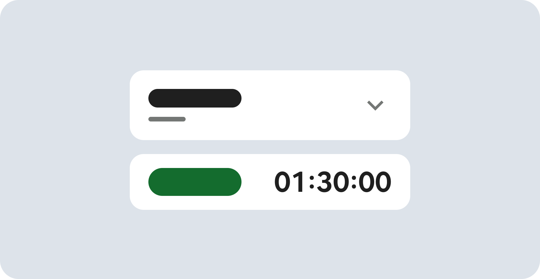
Note the lab's access time (for example, 2:00:00 hrs) and make sure you can finish in that time block.
A new panel will appear with the temporary credentials that you must use for this lab.
If you need to pay for the lab, a pop-up will open for you to select your payment method.
Tip: Open Looker in a new tab or a separate window, so you can see both the lab instructions and the Looker instance.
Important: You must use the credentials from the Connection Details panel on this page. Do not use your Qwiklabs credentials. If you have your own Looker account, do not use it for this lab.
After a successful login, you will see the Looker instance for this lab.
When you start the lab, it can take a few minutes for the data to populate in the Looker instance. When you see options (e.g. Flights) in the Explore dropdown located on the Looker navigation menu, you may proceed to the first task.
Using the Order Items Explore, you calculate the percentage of orders by traffic source (out of the total number of orders) in the past year, and display the results as a pie chart. Then, you add this visualization to a new dashboard for orders in the past year.
On the left-side navigation panel of the Looker User Interface, click Explore.
Under E-Commerce Training, click Order Items.
Click the arrow next to Order Items.
The available dimensions and measures will be listed in the data panel for Order Items.
Under Order Items > Measures, click Order Count.
Under Order Items > Dimensions > Created Date, click the filter icon next to Date.
From the Filters dropdown list, select "is in the past" and type: 1.
Then, select complete years.
Under Users > Dimensions, click Traffic Source.
Click the checkbox next to Totals on the Data bar menu.
Click Run.
In the data panel above Distribution Centers, next to Custom Fields, click + Add.
Select Table Calculation.
Name the new table calculation: % of Total Order
Add the following syntax to create the new table calculation:
Select Percent(1) - 123,456.8% as the format.
Click Save.
In the data window, click on the settings gear icon () next to Order Count, and select Hide from Visualization.
Click the arrow next to Visualization to expand the window.
Once the Visualization window has expanded, you can hover your cursor over the icons to identify the available options.
This option creates a pie chart visualization that you can customize. You can also make the chart larger by collapsing the data window.
Click on the settings gear icon for Visualization.
Under Plot, for Value Labels, select Labels.
Under Plot, for Label Type, select Label - Value.
Under Plot, for Start Angle, type: 90
Under Series, for Collection, select Vivid.
Click on the gear icon for Visualization to close the settings.
Click on the settings gear icon next to Run (top right of page), and select Save > To an existing Dashboard.
Enter a title for the visualization: Percent of Orders By Traffic Source
Leave the default destination as Shared.
Click New Dashboard.
Enter a title for the new dashboard: Orders in the Past Year
Click OK.
Click Save to Dashboard.
View the dashboard by clicking on the provided hyperlink titled Orders in the Past Year. When you have finished viewing, click Cancel.
The colors of your visualization may differ from those shown in the image.
Click Check my progress to verify the objective.
In this task, you calculate the percentage of orders by US State (out of the total number of orders) in the past year, and then display the results as a map. Then, you add this visualization to the dashboard you created in the previous task.
On the left-side navigation panel of the Looker User Interface, click Explore.
Under E-Commerce Training, click Order Items.
Click the arrow next to Order Items.
The available dimensions and measures will be listed in the data panel for Order Items.
Under Order Items > Measures, click Order Count.
Under Order Items > Dimensions > Created Date, click the filter icon next to Date.
From the Filters dropdown list, select "is in the past" and type: 1.
Then, select complete years.
Under Users > Dimensions, click the filter icon next to Country.
From the Filters dropdown list, select "is equal to" and type: USA
Under Users > Dimensions, click State.
Click the checkbox next to Totals on the Data bar menu.
Click Run.
In the data panel above Order Items, next to Custom Fields, click + Add.
Select Table Calculation.
Name the new table calculation: % of Total Order
Add the following syntax to create the new table calculation:
Select Percent(1) - 123,456.8% as the format.
Click Save.
In the data window, click on the settings gear icon next to Order Count, and select Hide from Visualization.
Click the arrow next to Visualization to expand the window.
Once the Visualization window has expanded, you can hover your cursor over the icons to identify the available options.
This option creates a map visualization that you can customize. You can also make the visualization larger by collapsing the data window.
Click on the settings gear icon for Visualization.
Under Value, enable the toggle bar for Reverse Color Scale.
Click on the gear icon for Visualization to close the settings.
Click on the settings gear icon next to Run, and select Save > To an existing Dashboard.
Enter a title for the visualization: Percent of Orders By US State
Select the dashboard you previously created: Orders in the Past Year.
Click Save to Dashboard.
View the final dashboard by clicking on the provided hyperlink titled Orders in the Past Year.
The dashboard for Orders in the Past Year will contain the two visualizations that you added in the first two tasks.
The colors of your visualizations may differ from those shown in the image.
Click Check my progress to verify the objective.
In this task, you use an offset function to calculate the percent change in number of items returned month over month in the year 2020 and display the results as a column chart. Then, you add this visualization to a new dashboard for orders and users in 2020.
On the left-side navigation panel of the Looker User Interface, click Explore.
Under E-Commerce Training, click Order Items.
Click the arrow next to Order Items.
The available dimensions and measures will be listed in the data panel for Order Items.
Under Order Items > Measures, click Order Item Count.
Under Order Items > Dimensions > Returned Date, click Month.
Under Order Items > Dimensions > Returned Date, click the filter icon next to Date.
From the Filters dropdown list, select "is in the year" and type: 2020
Click Run.
In the data panel above Distribution Centers, next to Custom Fields, click + Add.
Select Table Calculation.
Name the new table calculation: Items Returned Last Month
Add the following syntax to create the new table calculation:
Click Save.
In the data panel above Order Items, next to Custom Fields, click + Add.
Select Table Calculation.
Name the new table calculation: Diff From Last Month
Add the following syntax to create the new table calculation:
Select Percent(1) - 123,456.8% as the format.
Click Save.
In the data window, click on the settings gear icon next to Order Item Count, and select Hide from Visualization.
In the data window, click on the settings gear icon next to Items Returned Last Month, and select Hide from Visualization.
Click the arrow next to Visualization to expand the window.
Once the Visualization window has expanded, you can hover your cursor over the icons to identify the available options.
This option creates a column chart that you can customize. You can also make the visualization larger by collapsing the data window.
Click on the settings gear icon for Visualization.
Under Y, for Axis Name, type: Difference From Previous Month
Click on the gear icon for Visualization to close the settings.
Click on the settings gear icon next to Run (top right of page), and select Save > To an existing Dashboard.
Enter a title for the visualization: Monthly Percent Change in Items Returned
Leave the default destination as Shared.
Click New Dashboard.
Enter a title for the new dashboard: Orders and Users in 2020
Click OK.
Click Save to Dashboard.
View the dashboard by clicking on the provided hyperlink titled Orders and Users in 2020. When you have finished viewing, click Cancel.
The color of your visualizations may differ from those shown in the image.
Click Check my progress to verify the objective.
In this task, you use an offset function to calculate the percent change in number of users created week over week for May 15, 2020 to September 15, 2020 and display the results as a column chart. Then, you add this visualization to the dashboard you created in the previous task.
On the left-side navigation panel of the Looker User Interface, click Explore.
Under E-Commerce Training, click Order Items.
Click the arrow next to Users.
The available dimensions and measures will be listed in the data panel for Users.
Under Users > Measures, click Count.
Under Users > Dimensions > Created Date, click Week.
Under Users > Dimensions > Created Date, click the filter icon next to Date.
From the Filters dropdown list, select "is in range" and type: 5/15/2020 and 9/16/2020.
Click Run.
In the data panel above Distribution Centers, next to Custom Fields, click + Add.
Select Table Calculation.
Name the new table calculation: Users Last Week
Add the following syntax to create the new table calculation:
Click Save.
In the data panel above Order Items, next to Custom Fields, click + Add.
Select Table Calculation.
Name the new table calculation: Diff From Last Week
Add the following syntax to create the new table calculation:
Select Percent(1) - 123,456.8% as the format.
Click Save.
In the data window, click on the settings gear icon next to Users Count, and select Hide from Visualization.
In the data window, click on the settings gear icon next to Users Last Week, and select Hide from Visualization.
Click the arrow next to Visualization to expand the window.
Once the Visualization window has expanded, you can hover your cursor over the icons to identify the available options.
This option creates a column chart that you can customize. You can also make the visualization larger by collapsing the data window.
Click on the settings gear icon for Visualization.
Under X, for Time Label Format, type: %m-%d
Under Y, for Axis Name, type: Difference From Previous Week
Click on the gear icon for Visualization to close the settings.
Click on the settings gear icon next to Run, and select Save > To an existing Dashboard.
Enter a title for the visualization: Weekly Percent Change in Users
Select the dashboard you previously created: Orders and Users in 2020.
Click Save to Dashboard.
View the final dashboard by clicking on the provided hyperlink titled Orders and Users in 2020.
The dashboard for Orders and Users in 2020 will contain the two visualizations that you added in the last two tasks.
The colors of your visualization may differ from those shown in the image.
Click Check my progress to verify the objective.
On the left-side navigation panel of the Looker User Interface, click Folders.
Click Shared folders.
Click the Orders and Users in 2020 dashboard.
Click on the dashboard actions icon (three vertically stacked dots ).
Click Edit dashboard.
Resize the tile for Monthly Percent Change in Items Returned by clicking in the bottom right corner of the tile and dragging the cursor incrementally across the dashboard.
Increase the size of the tile until you see the x-axis label for December.
Repeat the previous step to resize the tile for Weekly Percent Change in Users.
Increase the size of the tile until you see the x-axis label for Sep 7.
Click Save.
When you have completed your lab, click End Lab. Qwiklabs removes the resources you’ve used and cleans the account for you.
You will be given an opportunity to rate the lab experience. Select the applicable number of stars, type a comment, and then click Submit.
The number of stars indicates the following:
You can close the dialog box if you don't want to provide feedback.
For feedback, suggestions, or corrections, please use the Support tab.
Copyright 2022 Google LLC All rights reserved. Google and the Google logo are trademarks of Google LLC. All other company and product names may be trademarks of the respective companies with which they are associated.

This content is not currently available
We will notify you via email when it becomes available

Great!
We will contact you via email if it becomes available

One lab at a time
Confirm to end all existing labs and start this one
